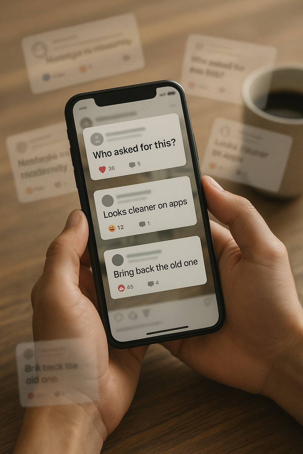
Cracker Barrel changed its logo and the internet lost it. The folksy man leaning on a barrel—an image used for decades—has been removed from the primary mark in favor of a simplified, text-first logo. Within hours came side-by-side comparisons, memes, and hot takes about “who asked for this?”
This piece is a straightforward walk-through of what changed, why it’s sparking backlash, what the company is likely aiming for, and how to think about the bigger brand system beyond a single mark.
1) What actually changed
- Illustration removed: The old man-and-barrel illustration is gone from the primary lockup. The wordmark takes center stage.
- Cleaner shapes & spacing: Letterforms are simplified for small sizes and screens; spacing is looser for legibility.
- System over single mark: The new identity leans on a broader toolkit (type, color, patterns, motion) so the brand can flex across digital, packaging, signage, and apps.
2) Why people are mad
- Nostalgia loss: The illustration signaled “country store” warmth. Removing it feels like erasing the brand’s story for some fans.
- Internet amplification: Logos are easy to screenshot, mock, and meme. Aesthetic shock spreads faster than the strategy behind it.
- Change fatigue: After years of brand simplifications, audiences are primed to see every refresh as “another corporate blanding.”
- Identity vs experience: People rarely separate the logo from the dining experience—so a logo change can be read as “the place is changing” whether or not it is.
TL;DR: The backlash is more about emotion (nostalgia, identity) than about vector curves.
3) What the company is likely aiming for
- Digital clarity: App icons, map pins, rewards programs, and social avatars demand simple marks that read at 16–32 pixels.
- Consistency at scale: A pared-down system is easier to deploy across thousands of touchpoints (menus, signage, uniforms, delivery, e-commerce).
- Modernization without a full personality swap: The surrounding system (tone of voice, photography, store design) can still carry “country store” cues even if the logo is minimal.
- Future-proofing: A simpler core mark is easier to animate, localize, and pair with sub-brands and limited-time programs.
4) How to evaluate the refresh like a strategist
- Judge the whole system, not just the avatar. Ask: typography, color, illustration style, motion, packaging—do they still tell the same story?
- Look at key use cases. Menu heads, signage at 50 feet, app icon at 24 px—does the identity work where it actually lives?
- Track sentiment alongside sales/visits. Online gripes are loud; the metrics that matter are traffic, ticket size, loyalty engagement, and guest experience.
- Mind the store experience. If the food, service, and retail nooks feel consistent, the logo shock usually fades in a quarter or two.
5) Why the shift feels sudden
Most brand programs roll out over months: signage, packaging, websites, uniforms, interiors. The public sees only the logo first, so it feels like an abrupt identity swap even when the rest is staged thoughtfully. That gap between “new avatar” and “full experience” is where confusion—and memes—live.
6) What it means for fans
- You’re allowed to miss the illustration. Nostalgia is a feature, not a bug.
- The experience will do the talking. If the dining room, store, and service still feel familiar, most guests will adapt quickly.
- The old art isn’t gone forever. Heritage marks often return on merch, seasonal packaging, or in-store storytelling.
Bottom line
The logo is simpler because modern brand systems need to be flexible and legible everywhere. Whether the change “works” won’t be decided by Twitter jokes—it’ll be decided by the full guest experience. If the refresh tightens execution without sanding off the warmth, the mark will settle in just fine. If not, expect a course-correction in the system around it.
Leave a Reply